Tamera Mowry-Housley's Living Room Feels Like a Hug
Tamera Mowry-Housley's living room pairs soft seating with stone, pillows, and a clearer indoor-outdoor route. Learn which layout lessons you can use at home.
A living room feels welcoming when it makes the next action easy: walk in, find a place to sit, set down a cup, turn toward someone, or step outside without squeezing past furniture. That sense of ease—not a particular sofa price or a pile of pillows—is what makes the room at the center of Tamera Mowry-Housley’s home story worth studying.
The reported redesign paired a generously cushioned sofa with pillows, a textured stone wall, and a change to the room’s connection with the backyard. Nearby, a former dining area became a built-in breakfast nook intended for meals and the less formal parts of family life. Those details belong to a specific earlier home feature, not a claim about her present-day residence; public reporting in 2026 describes a separate home project and a change in the family’s housing plans (Realtor.com’s 2026 report). The useful question is what each choice solved—and how to borrow the logic without copying the house.
Mowry-Housley has spoken publicly about a traditional style with Mediterranean and French-country touches, a high-low mix, and a preference for a home that feels like a sanctuary (HGTV’s interview with Mowry-Housley). A Wine Spectator home feature republished on her site also describes a practical, room-by-room renovation with designer Tiffany De Tomasi, rather than a one-day makeover (the Wine Spectator feature on Mowry-Housley’s site). That background helps explain the design decisions, but the principles work in a rental, a small apartment, or a home with a very different style.
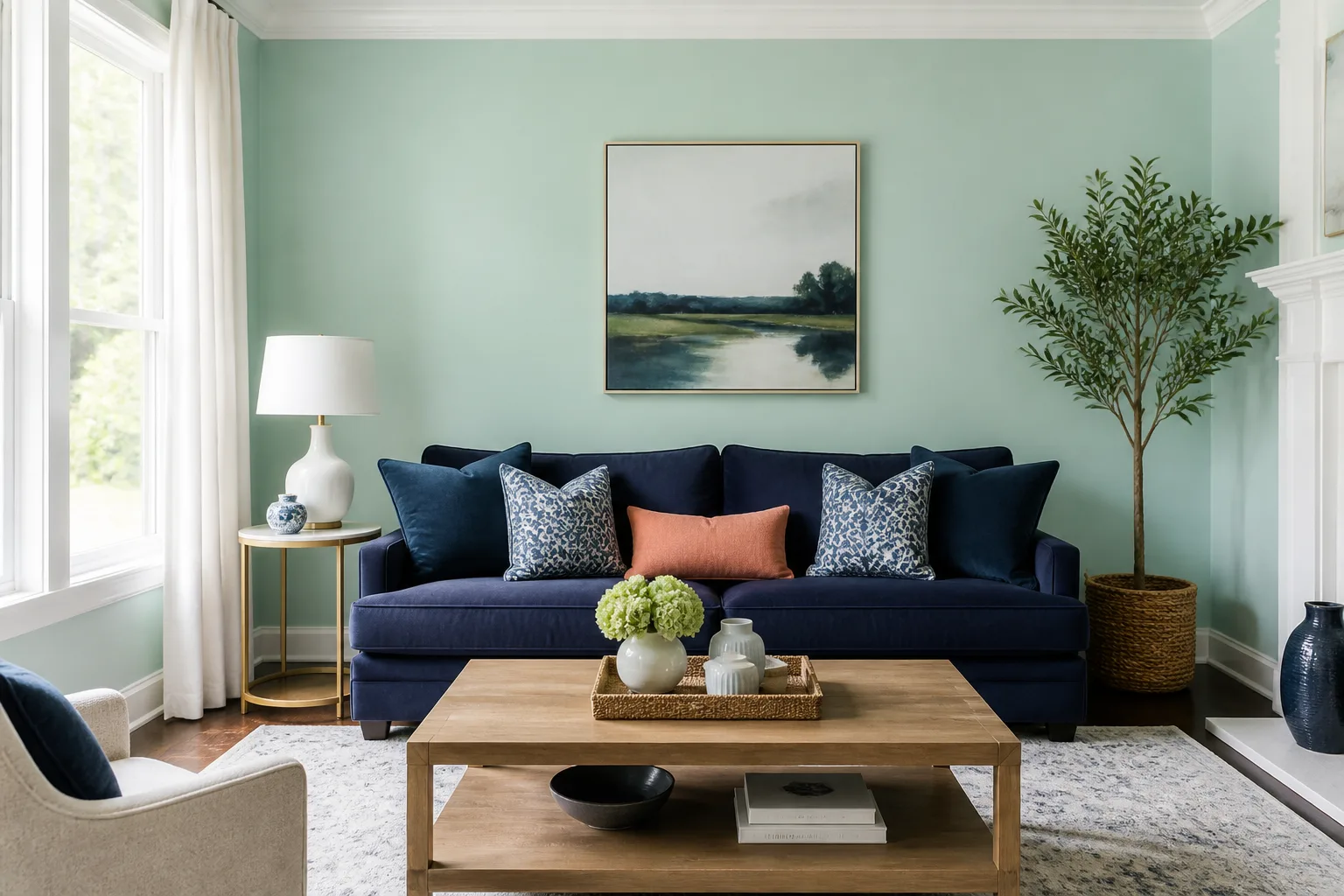
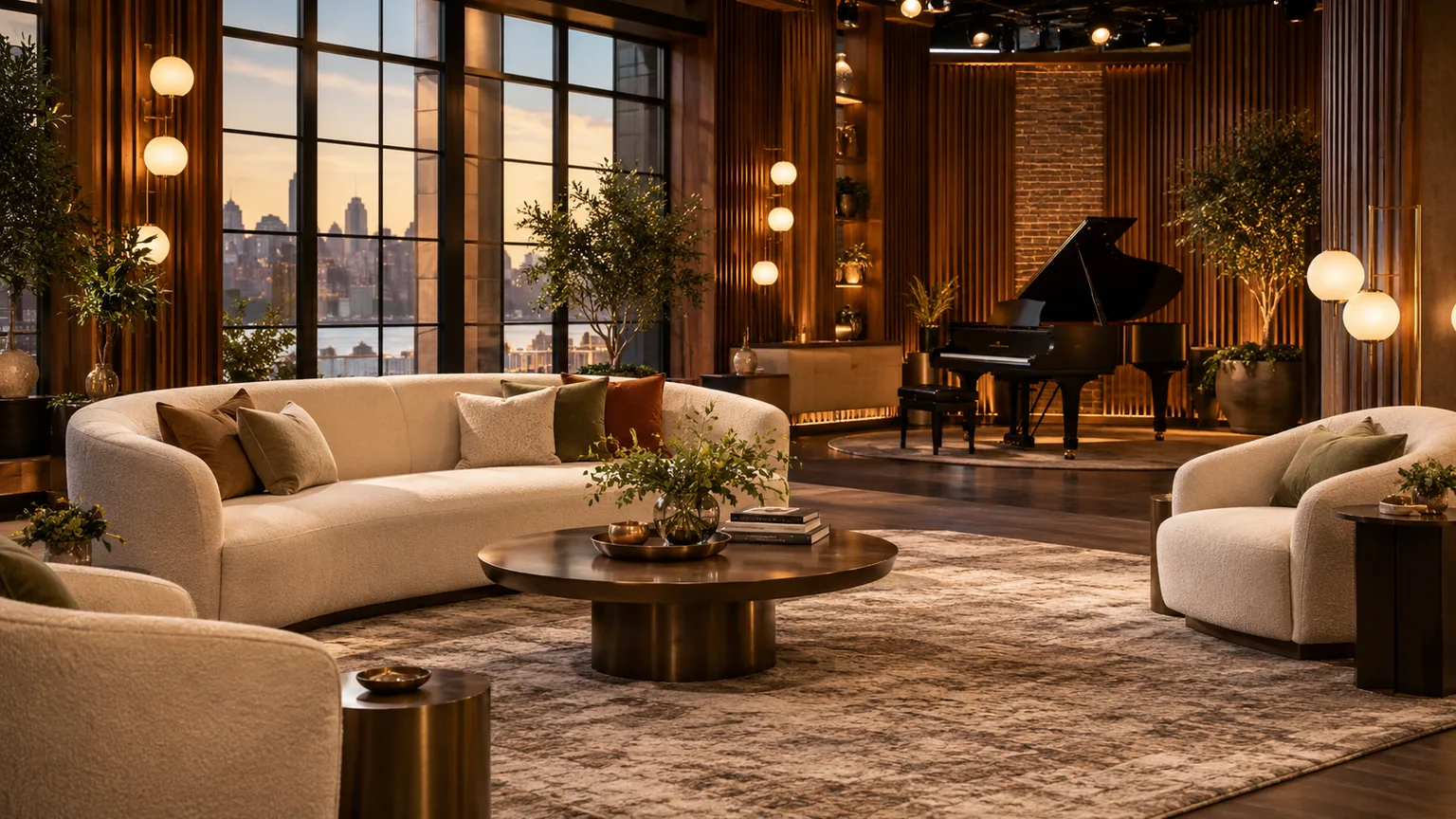
Illustrative image from the LeafyPixels image library; it is not a photograph of Mowry-Housley’s home.
A room feels like a hug when the path works
Start with how people enter and move through the room. If the shortest route from the hall to the kitchen cuts between the sofa and the main seats, guests cross the conversation instead of joining it; if everyone has to walk around a chaise to reach the backyard, the furniture is deciding how the room is used. The Houzz layout guide recommends thinking about circulation and conversation together, and its designers caution against making people feel trapped or forcing them to loop around furniture (Houzz’s living-room planning guide).
A useful test is to walk the room the way a guest would: enter with a bag, carry a plate from the kitchen, move toward the patio, and sit down while someone else is already there. Notice where you turn sideways, bump a table, or step through a sightline. Mark that route with painter’s tape before moving heavy pieces. Keep the route legible, then gather the seating just close enough that people can talk at a normal volume.
A designer’s layout advice in Apartment Therapy also treats the room as a place for multiple activities—watching a show, reading, conversation, and sometimes dining—rather than a set of furniture arranged for one photograph (Apartment Therapy’s living-room layout guide). In Mowry-Housley’s room story, the feeling of flow mattered enough to prompt changes to the openings between the interior and the yard. You may not need construction: often pulling the sofa away from a doorway or rotating a chair a few degrees changes the route and the social geometry at once.
Treat door openings like furniture
A door is not just a wall feature; it reserves floor space, frames a view, and directs movement. The room account describes shifting the living room’s connection to the backyard toward French doors, while changing the adjacent dining area’s exterior doorway into windows. That reallocation makes sense as a design response to how the two spaces were used: the living room gained a more direct outdoor connection, while the eating area could become a tucked-in destination instead of a pass-through.
This is a bigger intervention than changing a rug or moving a sectional. New doors can affect structure, weather sealing, drainage, security, privacy, energy use, and the placement of furniture. Before cutting a wall, ask a qualified contractor or architect to confirm what the wall supports, what permits apply, and whether the door’s swing will collide with a path or seating. Then test the imagined opening with tape or a temporary screen. If a new door would create glare, traffic, or privacy problems, keep the existing opening and let furniture or window treatments improve the connection instead.
The transferable idea is to plan around the route before you settle on the look. Mowry-Housley has described Napa’s “outdoor-inside” lifestyle in a first-person Visit California interview (Visit California’s Q&A with Mowry-Housley). For a home with a patio, garden, balcony, or even a sunny view, a clear threshold can make the room feel larger without adding square footage. If the outside space is not private or comfortable year-round, a generous window and a chair placed to enjoy it may do more than a new door.
Make adjacent spaces cooperate
Open-plan design is not the same as one large room where every activity happens in the same spot. A living area, kitchen, and breakfast nook can stay visually connected while each has a job. The living room can support lounging and conversation; a small nook can become the natural place for breakfast, crafts, or homework; the kitchen can stay close enough for people to talk while food is prepared.
The benefit of a nook is not that it is inherently cozier than a dining table. It is that a built-in bench can use a corner efficiently, leave more open floor nearby, and make a small meal feel like a destination. Its limitation is flexibility: a fixed bench may not suit every body, and a table sized to the nook may be harder to repurpose for a larger group. If your household hosts often, combine a banquette with movable chairs or choose a compact freestanding table that can shift when needed.
Mowry-Housley has described a preference for a family home where people can gather rather than retreat into separate rooms; that intent also fits the way she has described her design priorities in interviews. The design lesson is to put the most common activity where it is easiest to start. If children gather at the kitchen counter, a distant formal dining room may not get used. If the living room is the movie-night room, a nook will not replace the sofa. Build around habits that already exist, not an imagined picture of ideal family life.
Choose a sofa people can use, not just admire
A “hugging” sofa is best understood as a fit between the seat and the people who will use it. The seat should feel supportive rather than so deep that shorter users must perch forward; the arms should be comfortable to lean on; and the cushions should recover after ordinary use. A wide sectional can invite everyone to stretch out, but it can also block a route, dominate a small room, or make it difficult for someone with limited mobility to get up.
Before buying, measure the sofa’s full footprint, including the chaise, and compare it with doorways, turns, and the walking route. Tape the outline on the floor and put a chair at the far end as a stand-in for other seating. Then sit on the actual model for several minutes, ideally in the posture you use at home—not just upright in a showroom. Apartment Therapy gives 16 to 18 inches between a sofa and coffee table as a general layout starting point, but the comfortable distance depends on legroom, mobility, and whether the table needs to be reachable from every seat (Apartment Therapy’s living-room layout guide).
A comfortable sofa does not have to be enormous or expensive. A smaller sofa with an ottoman, one deep chair, or a movable pouf may offer more useful postures than a giant sectional. Ask who gets the “good seat,” whether a guest can enter and exit without disturbing everyone, and whether the sofa works for reading as well as television. The answer should be more specific than “it looks cozy.”
Use textiles to tune comfort
Pillows and throws are adjustable layers: they change the way the sofa feels without locking the room into a permanent decision. A small number of pillows in different scales can support the lower back, create a softer armrest, and add surface texture. A washable throw can make a seat warmer in winter and protect a high-use spot from everyday wear. The goal is to make comfort available, not to cover every seat until no one knows where to sit.
Try one large back pillow, one smaller lumbar cushion, and a throw where someone actually reaches for it. Sit down and test the arrangement. If cushions slide, swallow the seat, or have to be moved to make room, remove one. Consider removable covers and fabrics that can tolerate the household’s real use; “performance” labels vary, so check the care instructions and stain limitations before buying. A beautiful fabric that requires constant vigilance can make a family room feel less welcoming.
Textiles also soften the visual impression of hard materials. A rug under the front legs of the sofa and chairs can make a group read as one place to gather, rather than separate pieces marooned on the floor. Designers quoted by Apartment Therapy recommend a rug large enough to connect the seating group and adding multiple light sources when overhead lighting feels harsh (Apartment Therapy’s living-room design rules). Treat those as practical defaults, not laws; a small room, radiant floor, or mobility need may call for a different arrangement.
Let one strong texture carry room character
The room profile describes leftover exterior stone being used on an interior wall after the family had more material than the original landscaping job required. The detail is useful because it turns a procurement mistake into a design decision, but stone is not automatically cozy. Its appeal is contrast: a rough, irregular surface gives the eye something to read against a smooth wall, soft upholstery, and textiles.
If you are considering an accent wall, first ask whether the material belongs in the room’s architecture and whether it will dominate the view from the entrance. Sample the stone in the actual light, check how it looks beside the floor and upholstery, and confirm the wall can support its weight. A full-height wall in a small, dim room may feel heavy; a fireplace surround, partial wall, or textured plaster finish may create the same focal point with less visual weight.
The strongest accent materials have a reason to be there: local stone, reclaimed wood, tile carried over from a renovation, or a piece of art with a personal story. Avoid adding an expensive surface just because the room feels unfinished. Sometimes the missing layer is a lamp, a larger rug, a framed photograph, or simply a chair turned toward the rest of the seating.
Balance rough surfaces with soft ones
A room that uses stone, metal, and wood can feel grounded, but if those hard surfaces dominate, the space may read cold or echo-prone. The counterweight is not necessarily more beige. It can be a thick rug, an upholstered chair, woven baskets, curtains, a substantial wood table, or a tactile throw. Vary the feel of surfaces as well as their color: linen against polished metal, nubby fabric against smooth wood, or matte ceramics beside glass.
Use a simple visual check from the doorway. If the first impression is all hard material, identify one large soft plane to balance it. If the room looks puffy and indistinct, add a sharper edge—a wood table, a metal lamp, or a crisp frame. This avoids the common trap of solving every mismatch with another accessory. The room needs a few intentional contrasts, not a new collection of small objects on every surface.
Scale matters too. Architectural Digest’s designers recommend using a large rug and well-proportioned lighting to give an open room a more intimate sense of place, and they note that layered rugs can rescue a smaller favorite rug when it cannot anchor the whole seating group (Architectural Digest’s guide to scale and proportion). In practice, one generous rug usually connects a family-room grouping more convincingly than several tiny mats. If the rug cannot be large enough for every furniture leg, place at least the front legs of the seating on it and leave a clear border around the group.
Mix style languages through repetition
Mowry-Housley has described her own taste as traditional, with Mediterranean and French-country influences, while also leaving room for her husband’s more eclectic preferences. That combination is easier to understand as a shared rhythm than as a strict style label. The room can mix an old-world material, a tailored sofa, a contemporary lamp, and a personal object when one feature repeats across the grouping—warm wood, a subdued color, a curved shape, or a similar finish.
When two people have different tastes, each person can choose a few non-negotiables, then agree on the elements that connect them. One partner might bring the collectible object; the other might choose the upholstery. Repeating one color in a pillow, artwork, and small accent can make different pieces feel related without buying a matching set. If the mix still looks scattered, remove the item with no relationship to the palette, room function, or person who lives there.
The Wine Spectator feature credited designer Tiffany De Tomasi and described Mowry-Housley’s gradual room-by-room approach, which is also a useful way to avoid forcing every style choice at once. Live with one piece, notice what the room needs next, and let the design develop in layers. A room that is collected over time often accommodates meaningful objects better than one filled in a single shopping trip.
Spend on the anchor, thrift the conversation pieces
Mowry-Housley has also described mixing custom furniture with lower-cost finds. That “high-low” approach is not a formula where one expensive sofa excuses a room full of impulse purchases. It is a way to choose where quality matters most and where a small, replaceable object can bring a point of view. A sofa used every day may justify a higher budget if its frame, construction, and fabric meet your needs; a side table, lamp, or conversation-starting object might be a secondhand find.
Set a total budget before browsing and reserve room for delivery, rug pads, lighting, and repair—not only the headline item. If the sofa consumes the entire budget, existing chairs can remain while you save for a more suitable rug. If you thrift, check joints, odors, upholstery seams, and whether an item fits the route into the room. Low price does not make a poor-fit piece a bargain.
A mix feels intentional when the inexpensive object has a job: it gives a guest a place for a drink, stores a blanket, or adds a memory the room would otherwise lack. A purchase that needs another purchase to make it look right is a warning sign. Keep the focus on the lived experience, not the label or the price tag.
Use color to calm without flattening the room
A calm palette need not be a blank palette. In her HGTV interview, Mowry-Housley said she gravitated toward blues, grays, and whites for a soothing effect in a busy family home (HGTV’s profile). That is evidence of her own preference, not a universal color prescription. A room’s light direction, floor color, and neighboring rooms change how any paint or upholstery shade reads.
Start with a color already fixed in the room—a floor, stone, wood, or piece of art—then pull one quieter color from it for the sofa or walls. Add contrast through a darker frame, patterned pillow, or plant rather than distributing a new accent color into every object. Before painting, test large swatches on more than one wall and look at them morning and evening. Warm bulbs can shift a gray; shade can make a blue look much darker than it did in the store.
If the palette feels too flat, change texture and value before adding more hues. A pale wall, medium wood, deep blue sofa, and soft cream rug can feel layered even when there are only a few colors. If it feels busy, repeat a color in larger areas and edit small accents. The room should still feel coherent when the pillows are removed for washing.
Make an open plan connected, not undefined
An open plan works when people can see and reach each other without every activity visually competing. Anchor the living area with a rug, orient the sofa toward a conversation partner or focal point, and keep a clear route to the kitchen or exterior. A console behind a floating sofa, a different ceiling fixture over a dining table, or a shift in flooring can make zones readable without a wall.
Do not push every piece against the perimeter just to preserve an empty center. A small gap between furniture and wall can create a more intimate seating group, while the sofa’s back can help distinguish the lounge from a dining or kitchen path. Apartment Therapy’s layout examples show both separated and integrated dining zones, and they emphasize that a rug, furniture orientation, and the room’s constraints change how much separation is needed (Apartment Therapy’s layout guide). The right arrangement depends on door positions, outlets, windows, and what people actually do there.
Before adding a screen or a statement wall, check whether people can see one another from the seats. A television may be the primary focal point in a movie room, but a living room used for meals, homework, and conversation may need a second focal point: the garden view, fireplace, artwork, or a central table. No single arrangement is best for every household. The test is whether each important activity has a comfortable place and the transitions between them feel natural.
Design a nook around the workday too
A breakfast nook earns its space when it serves more than one moment. In the room story, Mowry-Housley described the nook as a place to eat, talk, make crafts, and help children with homework. Those uses point to the parts of a nook that matter: enough knee room, a table surface that can handle a project, comfortable seating for the time spent there, and storage nearby for the materials that otherwise take over the tabletop.
For a built-in bench, check the seat depth and table height with the people who will use it. Fixed benches can make efficient use of an awkward corner, but they may be uncomfortable for taller people, harder for someone with limited mobility, or difficult to pull away from for cleaning. Add chairs on the open side if possible. A freestanding table is more adaptable if you rearrange often or want to host a larger group.
Plan lighting and cleanup as carefully as cushions. A pendant should illuminate the table without blocking sightlines; a washable seat pad can add softness without turning a bench into a high-maintenance project. Put a basket or drawer within reach for pencils, chargers, placemats, or the craft supplies that make the nook useful. If the table becomes a permanent drop zone, give everyday items another landing place rather than assuming a built-in will solve clutter by itself.
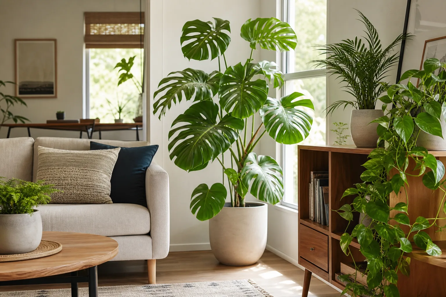
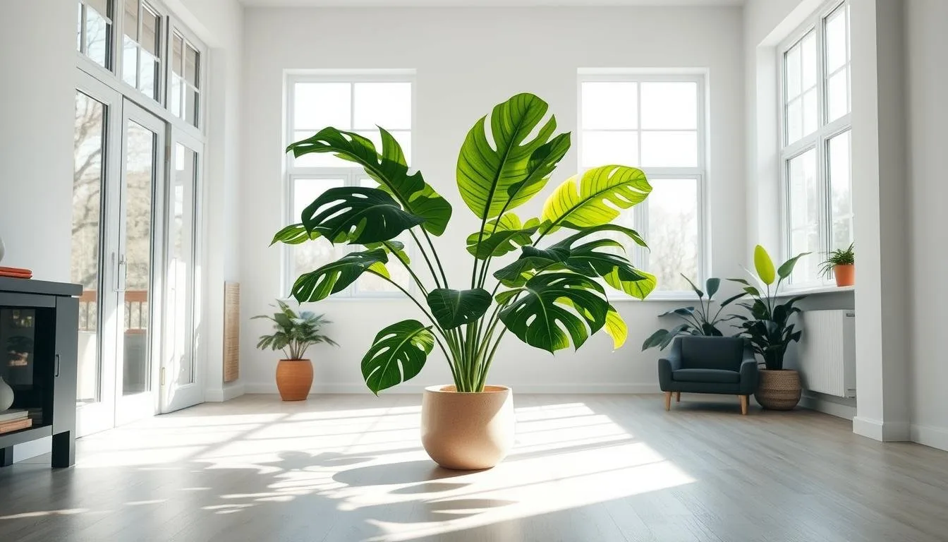
Illustrative image from the LeafyPixels image library; greenery and soft furnishings are shown as adaptable styling layers, not as details documented in Mowry-Housley’s room.
Test comfort before buying or renovating
A room plan can look convincing on a screen and fail when a person carries laundry through it. Before a major purchase, make a quick full-scale mock-up: tape the sofa and rug dimensions, place boxes where end tables would go, and use dining chairs to represent the extra seating. Run the route to every door several times, then try the activities the room must support—watching a film, reading, talking across the seating group, or setting down snacks.
Do the test with the people who use the room, not only the person who chooses the decor. Ask a child to reach the table; ask a guest to find a seat; try standing up from the deepest cushion; check whether someone can pass behind a seated person without asking them to move. These small trials expose practical problems before delivery fees, construction, or returns turn a design mistake into an expensive one.
If you are considering a structural change, get professional advice before relying on a tape outline as proof it is feasible. If the issue is simply that the room feels cold or uninviting, begin with the reversible fixes: clear the walking lane, angle chairs toward one another, add a lamp, and place a rug under the front legs of the seating. Change one variable at a time so you know what actually improved the room.
Know when a simple reset is enough
Not every awkward living room needs French doors, custom upholstery, or stonework. If the main issue is a blocked route, move the sofa. If people sit far apart, bring chairs closer and add a small table within reach. If the room feels stark, add one soft surface or a warmer pool of light. If a corner never gets used, give it a clear purpose—a reading chair, a small work surface, or storage for the activity that already happens there.
A renovation earns its cost when a fixed constraint prevents the room from doing what the household needs. Examples include a doorway that repeatedly cuts through seating, a wall opening that prevents a usable layout, or a dining corner that cannot accommodate a table. Even then, define the problem in one sentence before meeting a contractor. “We need a safer, clearer route from the kitchen to the yard” is more actionable than “we want the room to feel nicer.”
For inspiration, Mowry-Housley’s official home page currently groups rooms and decor as separate areas rather than one universal look (her home-design page). That is a useful reminder: a room’s style should follow its job and the people who use it. Take the logic—comfortable seating, useful circulation, material contrast, and a place to gather—and leave the celebrity-specific scale or finish behind if it does not fit your home.
Conclusion
The feeling of a welcoming living room comes from a chain of small decisions: a route that does not cut through conversation, seating that supports real bodies, soft materials against harder surfaces, and details that reflect the household rather than a showroom. Mowry-Housley’s earlier room story brings those pieces together with a family nook and a stronger connection to the outdoors, while her interviews show that her personal style is traditional, layered, and rooted in how she wants home to feel.
You can translate that approach without copying the stone wall or ordering a custom sofa. Start by walking the room, move the furniture to clear the route, and test how the seats work for the activities you actually do. Add one tactile layer, one useful light source, or one object with a real story. When people can enter, sit, talk, and stay awhile without negotiating the furniture, the room is already doing the work of a hug.