Paris Hilton’s Pink Kitchen: Color and Design Guide
Explore Paris Hilton’s pink kitchen design and learn how to choose a pink shade, pair warm metals, plan lighting, and keep a colorful kitchen practical.
What defines the kitchen—and what is worth borrowing
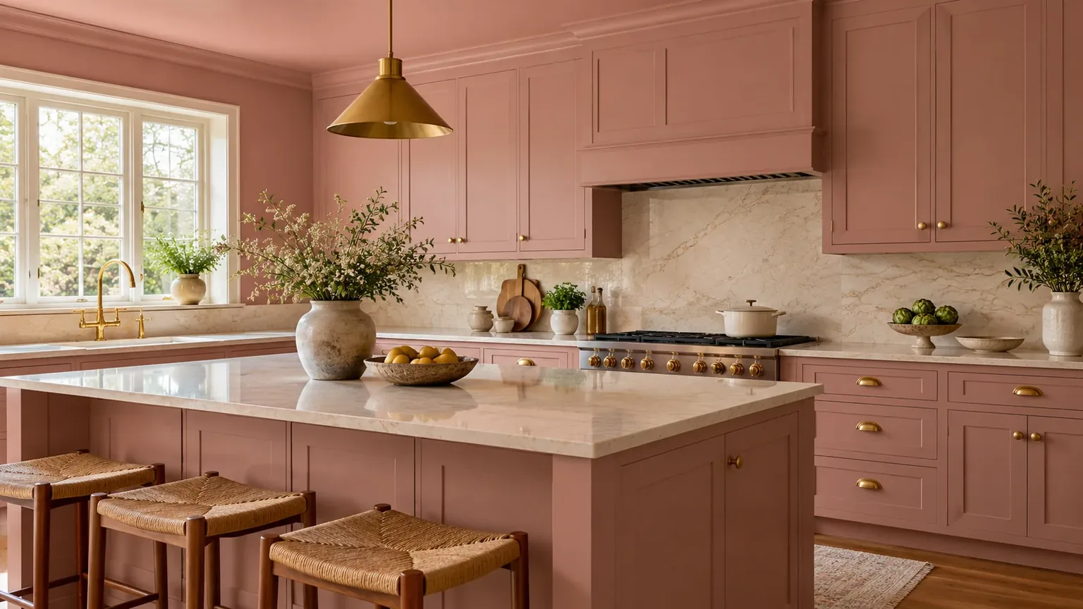
The most recognizable design move in Paris Hilton’s kitchen is the commitment: pink cabinetry is carried overhead onto a pink ceiling, while gold-toned hardware and a gold sink add a warm, reflective counterpoint. The room was also used as a backdrop for cooking and product content, so the design needed to read clearly on camera as well as feel inviting in person. Those are useful facts about the brief, but the exact paint brand, finish, and construction specifications are not identified in the original interview.
That distinction matters if you want to adapt the look. A celebrity kitchen may have been planned around a specific room, production lighting, and a campaign; it is not a ready-made specification for a family kitchen or a rental. You can borrow the design logic—repeat one expressive color, repeat a metal finish, and keep the work surfaces legible—without copying every pink surface or buying a matching collection.
There is also more than one way to interpret the color. A later photograph of Hilton’s kitchen was described as dusty rose, a softer direction than saturated bubblegum pink. That difference is a reminder to evaluate the actual shade in your own light instead of shopping by a celebrity label or a tiny screen image. A published look at the pink cabinetry shows how a subdued rose can remain expressive while feeling more adaptable.
Start with your level of commitment
Before choosing a paint chip, decide where the pink will live and how difficult it would be to change. A whole-room scheme with cabinetry, ceiling, and accessories has the strongest identity, but it also connects the color to many expensive or time-consuming surfaces. A single pink island or a few appliances makes a smaller visual statement and is easier to update when your preferences or household needs change.
Treat the decision as three levels. Low commitment means small appliances, a runner, ceramics, stools, or a pink backsplash decal where appropriate; it lets you test whether you enjoy the color during ordinary mornings, not just in a styled photo. Medium commitment could be an island, lower cabinets, or a painted ceiling with neutral cabinetry. High commitment means a larger cabinet run, both upper and lower cabinets, and possibly the ceiling, so the shade must work with fixed counters, flooring, daylight, and adjacent rooms.
The safest place to make a permanent color statement is usually a surface that can be refinished without changing the room’s plumbing or layout. Cabinet doors can be painted or replaced, but the success of either option depends on their material and condition. A pink faucet or sink is a much more permanent and specialized purchase than a pink countertop appliance, so evaluate serviceability and replacement cost before treating a finish as a decorative accent.
The low-commitment route
If you rent, share the home, or simply do not know whether you want pink every day, build the palette with items that move. Choose two or three coordinated touches—perhaps a small appliance, washable runner, and a set of dishes—then repeat one warm metal through a lamp or cabinet knob only if the existing hardware allows an easy swap. Repetition gives the color a reason to be there; a single pink object can feel like an accidental purchase.
Give the test period real time. Use the kitchen for a week or two, notice whether the pink feels too strong at breakfast or under evening bulbs, and see whether it competes with food, artwork, or nearby living-room colors. If the answer is yes, keep pink below eye level or restrict it to items stored on open shelves. This is a practical way to check your tolerance before commissioning cabinets or committing to a whole-room repaint.
Choose pink by undertone, not by name
“Pink” covers a wide range: pale shell, peachy rose, dusty mauve, cool ballet pink, and vivid magenta can behave like entirely different colors beside the same white counter. Compare undertone as well as lightness. A warm pink with peach or yellow in it tends to sit comfortably with creamy whites, honey oak, and brass; a cooler pink may look cleaner next to crisp white, blue-gray, chrome, or black accents.
Your room’s fixed elements narrow the choice. Put candidate samples next to the countertop, backsplash, flooring, and the largest appliance, not just against a white sheet of paper. If the counter has gray veining, test whether the pink makes that gray look blue or muddy; if the floor is orange-toned wood, a cool lavender-pink can create a clash that a muted rose might avoid. When a fixed surface has a strong undertone, choose a pink that relates to it rather than expecting decor to disguise it.
Size changes the effect too. A light blush covering every cabinet can still feel dominant because cabinetry occupies a large visual area; a saturated shade on a small island can have more impact than its square footage suggests. For a kitchen that already receives limited daylight, a middle-value dusty rose may preserve softness without asking the room to depend on bright white surfaces for contrast. For a sunlit room, a stronger pink can look lively, but sample it in the afternoon when direct sun may shift its appearance.
Do not use an online photo as the final color test. Sherwin-Williams notes in its color-visualizer guidance that an on-screen view may differ from actual color and advises confirming a choice with a physical color chip, card, or painted sample. Make large sample boards and move them among the sink, cooking zone, and doorway; check them in morning daylight, at night, and with the lights you intend to keep. This simple test catches undertone and brightness surprises before they are repeated across a full set of doors.
Build a palette that gives pink room
A successful colorful kitchen usually has a supporting cast rather than a second headline. Start with pink as the main color, then select a light neutral, a natural or dark grounding material, and one metal finish. For a soft look, try rose cabinetry, warm white counters, pale oak, and brushed brass; for a sharper look, pair pink with crisp white, charcoal details, and polished chrome. These are starting relationships, not rules: the precise tone of your surfaces should decide the final combination.
Texture keeps a restricted palette from feeling like a paint sample. A smooth painted cabinet, veined stone or a quiet solid counter, a tactile wood stool, and ribbed glass reflect light differently even if the colors stay restrained. You can also introduce a darker grounding note with a black range, dark floor, or deep green plant, but keep it in deliberate places so it reads as contrast instead of an unrelated accent.
A range of pink kitchen treatments illustrates why pink can work in very different amounts: it can sit on walls, tile, or cabinetry, and it can be softened with neutrals or natural materials. Use that range to identify the mood you prefer, then reduce the palette to finishes already present in your kitchen. Choosing pink first and inventing the rest later often leads to extra purchases and visual competition.
Pair brass and gold deliberately
Gold is effective beside pink because it adds warmth and catches light, but “gold” can refer to several finishes: polished brass, brushed brass, champagne bronze, antique brass, or gold-colored plated hardware. Bring samples home and compare them against the faucet, appliance trim, and cabinet color. A warm brushed finish tends to make a room feel gentler; a glossy yellow-gold finish becomes a stronger accent and shows fingerprints or water marks more readily.
Choose a hierarchy instead of making every object metallic. A faucet and cabinet pulls can share a finish, while the pendant, appliance trim, and accessories may be quieter or different if their scale is small. Too many competing gold tones can look like a mismatch; if your sink is already stainless steel, keep it and use brass on a limited set of replaceable hardware rather than creating a costly fixture replacement just to make the palette uniform.
Metal also needs to suit use, not only color. A faucet is touched and cleaned constantly, so its finish and maintenance requirements matter more than a decorative knob. Keep a sample of the actual finish in the room before ordering a large quantity; warm metals can look yellow, pink, or brown depending on surrounding colors and lighting.

Color-drench cabinets and ceiling without flattening the room
Color drenching means carrying one color or a close family of colors across multiple surfaces so the room reads as one composed envelope. In the Hilton kitchen, the pink cabinets and matching ceiling create that continuous, high-impact effect. Repeating the color overhead can make a kitchen feel intentionally designed, but it can also remove the visual break that a lighter ceiling provides, especially in a low room or one with little natural light.
If you want the full effect, keep variation in materials and values. A satin cabinet finish beside a flatter ceiling, a light counter, and brass hardware gives the eye places to rest. The ceiling does not have to be an exact match: a lighter tint of the same pink family can visually connect it to the cabinets while preserving brightness. Sample the ceiling and cabinet colors together because a shade that feels subtle on a small door may dominate an entire overhead plane.
If your room is narrow, has a low ceiling, or opens directly onto a living area, consider confining pink to cabinetry and using a warm white ceiling. This creates a strong focal band without making every view into the kitchen entirely pink. A pink ceiling can still work in a high-ceilinged space or a deliberately playful studio, but the final call should follow the room’s proportions and sight lines rather than a blanket claim that the color makes a space larger or smaller.
Protect function in a camera-ready kitchen
A kitchen that looks composed in a photograph is not automatically useful for cooking. A clear counter, a cohesive color story, and a good view of the cabinetry help a room read cleanly on camera; real life also requires safe knife space, accessible storage, a working sink, sensible ventilation, and lighting that lets you see what you are preparing. Keep those priorities in the design brief before you start styling surfaces.
Hilton’s room served as a setting for cooking and video content, which helps explain the value of a memorable background and coordinated cookware. That lesson translates best as “make the room support the activity,” not “leave every counter empty.” A camera can frame one section, while a working kitchen needs storage for items used daily; use closed cabinets, a tray, or a dedicated shelf to contain small appliances between tasks.
The NKBA 2026 kitchen trends survey found that its industry respondents rated natural lighting, quality lighting, and task lighting for work zones as important considerations; the report says 95%, 93%, and 92% selected those respective priorities. The survey reflects 634 members and industry respondents who had worked on a kitchen project in the prior year, so it is a professional trend snapshot, not a poll of every household. Its practical relevance here is straightforward: a striking color scheme should not come at the expense of useful light where you prep and cook.
Plan work zones before styling
Map the ordinary sequence in your kitchen: where groceries land, where you wash produce, where you chop, and where you cook. Then protect a usable section of counter beside the sink and cooking area, and locate frequently used tools near the task they support. If a pink island is the visual center, make sure the island can still function as a prep surface rather than becoming the only place where decorative objects can sit.
Think about sight lines as well. Keep the most visible counter area simple enough to photograph or enjoy from the adjoining room, but give daily equipment a planned home. An appliance garage, a pantry shelf, or a cabinet with an accessible outlet can reduce visual clutter without forcing you to unpack a mixer or coffee maker from an inconvenient location each time you need it.
Use layered lighting to judge pink accurately
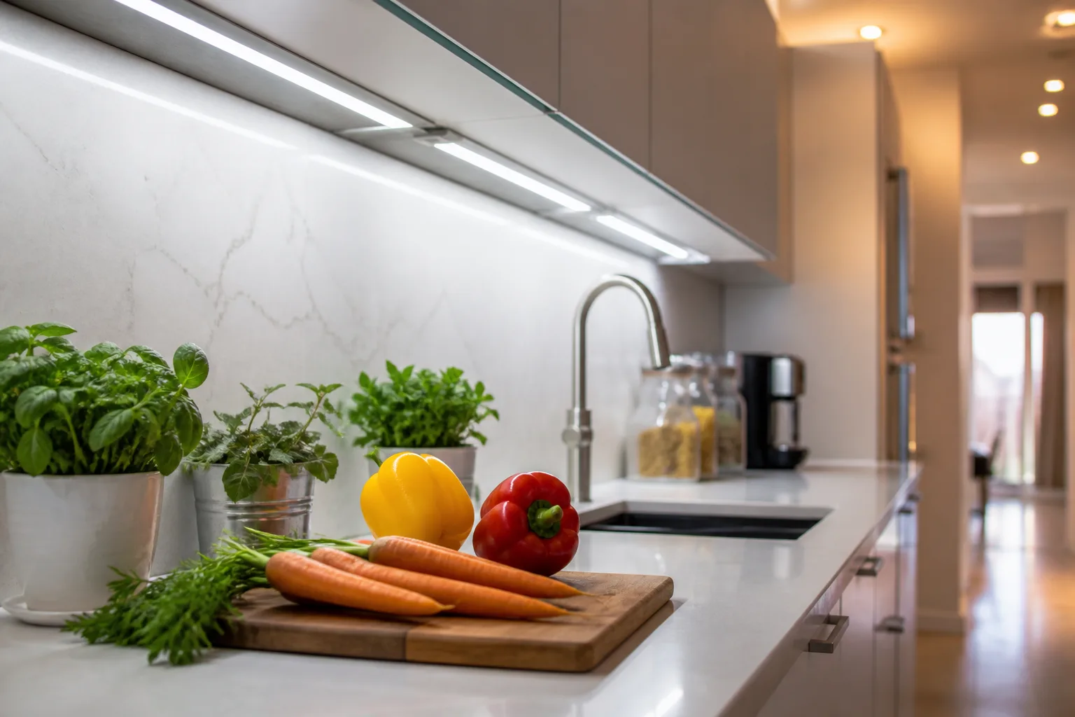
A kitchen needs more than a decorative pendant. General lighting makes the room navigable; task lighting illuminates counter work; accent or decorative lighting adds focus over an island, sink, or table. Under-cabinet lights can make a backsplash and work surface easier to see, while a pendant can define an island or eating area. Plan light placement around actual tasks and check for shadows cast by upper cabinets before selecting a fixture for appearance alone.
Pink is especially sensitive to what surrounds it because warm bulbs, cool daylight, and reflected colors can shift how a pale rose reads. A warm evening lamp may make a cool pink feel more purple or gray; a window with strong afternoon sun may make a muted pink appear more saturated. Evaluate the sample under daylight and the installed nighttime setting, and do not assume a filtered social video accurately represents either.
For a more camera-friendly result, use even, flattering light without sacrificing work visibility. If color-adjustable smart lamps are already part of your home, you can use scene settings for evening atmosphere, but keep a stable, bright task layer at the counter. The NKBA survey’s distinction between natural, quality, task, and decorative light is helpful here: ambiance should complement the work zone, not substitute for it.
Balance pink with counters, backsplash, and floors
Counters and backsplash cover broad, durable surfaces, so they strongly influence whether pink looks calm, glossy, vintage, or loud. Warm white quartz or a simple solid surface can give rosy cabinets a clean break; a veined stone can add movement if its pattern is not so busy that it fights the cabinetry. A neutral tile backsplash creates a quieter transition, while pink tile or wallpaper adds another layer of color and raises the commitment level.
When the cabinetry is already pink, avoid adding multiple elaborate patterns at once. If the counter has strong veining, choose a restrained backsplash; if the backsplash is patterned, keep the counter and floor quieter. Natural wood can soften the palette and bring a tactile note, but account for maintenance and moisture where the material meets a sink or dishwasher. Wood-look surfaces may provide the same visual warmth with different upkeep, so compare product specifications rather than deciding by a photograph.
Flooring is an especially important fixed element because it occupies a large area in open-plan views. Warm oak usually supports a peachy or dusty rose; gray tile may harmonize with cooler pinks but make a warm blush look more orange. Place a large sample of the cabinet color close to the floor and assess both together. If replacing the floor is out of scope, let its tone guide the pink rather than adding rugs or accessories in an attempt to conceal a permanent mismatch.
Plan for cookware, appliances, and open counters
Matching cookware can make a coordinated kitchen feel personal, particularly when it is used and displayed intentionally. It does not need to match the cabinets exactly. Choose one or two pink items that will earn their counter or shelf space, then use neutral dishes and utensils to keep the surfaces from turning into a product display. This approach makes a room feel like somebody cooks there rather than like every item was selected to echo a launch campaign.
Before buying pink appliances, check dimensions, ventilation clearances, power requirements, cleaning instructions, and warranty availability just as you would for any appliance. A color option can become harder to replace if it is discontinued, and a small appliance that is attractive but difficult to store can add clutter quickly. A removable stand mixer, kettle, or toaster is a lower-risk place to add color than a built-in range or refrigerator.
Use the same edit for accessories. Pick a few points where pink repeats—textiles, art, or ceramics—then allow ordinary objects to remain useful rather than color-coordinated. A well-planned kitchen can feel unmistakably pink while leaving room for stainless utensils, wooden boards, and the colors of food.
Translate the look to a rental or small kitchen
A rental kitchen can borrow the palette with movable pieces and temporary finishes that are approved for the surface. Try a pink kettle or toaster, removable cabinet knobs if the originals can be stored safely, a washable runner, or a framed print leaning on a shelf. Peel-and-stick finishes are not automatically safe for every cabinet or tile; test a small, hidden spot and check the lease or product instructions before covering a surface that may be damaged when removed.
In a small kitchen, use the color where it will be seen without blocking light. A pink backsplash accent or lower cabinets can create a focal point while leaving upper walls and the ceiling lighter. If open shelving is part of the room, keep the display edited so pink packaging, metallic utensils, and colorful dishes do not compete with one another. The aim is not to make every square inch look larger; it is to give the eye a clear focal point and keep the room easy to use.
For a shared home, agree on the permanent decisions separately from the accessories. One household member may love pink but another may be comfortable only with a pink island or removable objects. Testing that boundary with flexible items can prevent an expensive repaint from turning into a compromise nobody likes.
If repainting, sample and prep before buying
Painting existing cabinets can change a kitchen without replacing the layout, but it is not simply a matter of brushing color onto a door. Cabinet material, existing coating, grease, wear, and hardware holes all affect the result. Sherwin-Williams’ cabinet-painting guide emphasizes preparation and removing doors and hardware before painting; follow the product system’s current instructions for cleaning, sanding, primer, paint, drying, and cure time rather than improvising from a short makeover video.
Test the shade and the finish separately. A color sample on a small wall patch does not necessarily predict how it will look across a bank of cabinets, so use a large sample board or a spare door if available. Compare it to your countertop, backsplash, floor, and appliance surfaces under different conditions. Once you select the color, confirm that the finish is intended for cabinetry and can tolerate the cleaning and contact the kitchen will receive; decorative wall paint and cabinet coatings do not serve the same job.
Painting is a good fit when doors are structurally sound and you can take the time to prep and allow the coating to cure. It is a poor shortcut when doors are delaminating, hinges are failing, or you cannot keep the kitchen clear during the work. In those cases, a cabinet professional can assess whether refinishing, door replacement, or a limited-color feature is the better use of the budget. The least expensive paint job is not a bargain if poor adhesion means repeating the work soon.
If you are ordering new cabinetry, ask for a physical door sample and inspect the finish with your actual light and adjacent surfaces. Confirm lead time, touch-up availability, cleaning instructions, and whether the color can be reproduced later. Those details matter more when pink becomes a fixed large surface than when it is a replaceable countertop object.
Avoid common pink kitchen design traps
The first trap is choosing a color from a screen and then scaling it across the whole room. A digital image may be edited, filtered, or lit for a campaign; it cannot show exactly how your own north-facing window, warm LEDs, and beige stone will alter the color. Physical sampling and review at different times of day are the useful safeguards.
The second is adding too many “statement” elements at once. Pink cabinets, a pink ceiling, veined counters, patterned tile, multiple gold finishes, and colorful appliances all compete for attention if nothing is allowed to rest. Choose one large statement, one supporting feature, and mostly quiet surfaces; if the room still feels plain, add an accent after living with the base design rather than ordering everything at once.
Another common issue is confusing a camera backdrop with a maintenance plan. Glossy surfaces can reflect light but may reveal fingerprints, while deeper or more matte finishes may show dust or marks differently. Ask the cabinet or surface manufacturer for cleaning guidance and evaluate a sample in the spot where hands and splashes will be frequent. Beauty is not a finish specification.
Finally, do not assume a bold kitchen must be timeless to be worthwhile. A color can be personal and still be a good choice if the investment is proportionate, the surfaces can be maintained, and you are comfortable changing them later. If resale flexibility matters to you, concentrate the strongest pink on replaceable or refinishable elements and keep the costly fixed materials more restrained.
A step-by-step plan for your own pink kitchen
Start by listing the finishes you are keeping: counters, floor, backsplash, appliances, sink, and cabinet boxes. Photograph the room in natural and artificial light, then note the areas where pink will sit and the views where the color will be most visible. This inventory prevents you from selecting a cabinet color in isolation and discovering later that it clashes with a permanent surface.
Next, choose a commitment level and gather three pink candidates that differ in warmth or depth. Test large samples alongside the fixed finishes, and evaluate them across a full day and at night. Select a neutral, a grounding material, and a single metal family; do not add a second accent color until the core combination feels coherent in the room.
Then check the practical plan: can you prep food, reach the sink, store appliances, ventilate the cooking zone, and see the counter clearly? Add or adjust task lighting before buying decorative fixtures. If you will paint, inspect cabinet condition and test the coating sequence on a door; if you are renting, keep the core changes removable and confirm that adhesives or hardware swaps are allowed.
Finally, style the room after the functional decisions are settled. Bring in cookware, art, or textiles in a small number of deliberate repetitions, leave the main work surface usable, and live with the room before adding more. This staged approach makes it easier to keep what works and remove what does not, instead of making a full renovation depend on a single reference photograph.
Conclusion
Paris Hilton’s pink kitchen is memorable because it treats color as architecture: cabinetry and ceiling create the main statement, while warm metal and carefully considered presentation make the room feel finished. The useful takeaway is not that every kitchen should be pink from floor to ceiling, but that a bold choice looks intentional when its shade, supporting materials, lighting, and daily function are planned together.
Begin with the parts you can change, sample the pink beside what you are keeping, and choose the amount of color that suits your space and appetite for commitment. If the room still works for your real cooking routine after the styling is removed, the design has done more than photograph well.