How Kate Walsh Made Her Western Australia Home Feel Personal
Kate Walsh and Elissa Coleman paired ocean views, curved seating, collected finds and an Arizona-inspired cactus garden to make a Perth home feel personal.
Kate Walsh’s Perth beach house works because it does not ask the furniture to compete with the view. The reported home is a recently renovated, single-storey property with an open-plan kitchen, dining and living area, a meditation room and outdoor living; its backdrop is the Indian Ocean. The interior decisions take that setting seriously, then add the personal touches that keep the rooms from feeling like a generic coastal showroom. (Havenist’s home profile)
The most useful lesson is not to copy a celebrity’s shopping list. It is to notice how Walsh and interior designer Elissa Coleman balanced the site, the house’s modern bones, Walsh’s existing belongings and details that express her own history. The profile’s photos and descriptions are the available record, not a complete construction file; the images below are illustrative scenes, not photographs of Walsh’s home.
The real design brief starts with the Indian Ocean
The home’s ocean view is not an accessory added at the end. It shapes the first design decision: what should hold attention when someone enters the room? In a house where the view is the strongest element, furniture can frame it, furnishings can repeat a few natural tones, and decorative objects can stay quieter than the horizon.
That does not mean a coastal room needs white walls, shells or a blue-and-white palette. Walsh and Coleman’s reported choices lean toward raw materials, timber, natural textures and relaxed furnishings. The point is a relationship between the room and its surroundings—not a literal beach theme applied to every surface.
A recently updated house became personal through furnishing
The fuller home profile describes the property as recently renovated and in good condition, but still feeling like an empty shell. Coleman and Walsh planned the flow of the furnished rooms and selected items to work with pieces Walsh already owned. The feature does not document wall moves or construction work, so its strongest evidence is about room layout, materials and styling. (Havenist’s account of the design process)
This is a practical way to begin in any home. Before shopping, list what already works, what feels wrong, and what each room must do. A well-made inherited chair, a comfortable sofa or a favorite artwork can become the starting point; new items then solve a specific gap instead of replacing everything just because the room is being refreshed.
The palette is quieter—but not empty
Walsh’s Australian home was described as a calmer change from her more eclectic New York interior. A quieter palette can help an ocean view, timber grain and tactile materials register more clearly, but “neutral” should not mean making every surface the same shade of white. Vary the warmth, texture and reflectivity so the room has enough contrast to feel lived in.
A useful way to read the look is as warm minimalism with collected details: fewer competing colors, but a mix of old and new, soft and hard, matte and reflective. Livingetc’s explanation of Scandinavian coastal design similarly emphasizes simple planning, comfort, natural materials and a home that reflects its own stories—not a strict decorating formula. (Livingetc’s Scandinavian coastal guide)
The living room balances curves with clean lines
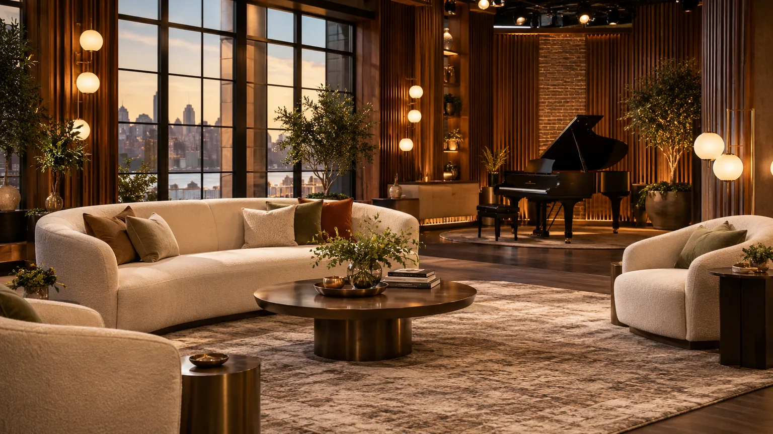
The house’s contemporary architecture reportedly had plenty of hard right angles. Walsh and Coleman softened that geometry with rounded seating: a curved sofa and accompanying armchairs rather than a room full of boxy silhouettes. A jute rug and a coffee table with a glass top and organic teak-root base add different shapes and textures without introducing a loud color scheme. (Havenist’s living-room description)

An illustrative interpretation of the design principles, not a photograph of Walsh’s living room.
Homes & Gardens notes that curved sofas can counter hard architectural lines and turn a seating group inward, making conversation more natural. That works only when the curve fits the room: measure the sofa’s widest points, leave a clear path around it, and check that its back does not block a view or doorway. (Homes & Gardens on sofa shapes)
In an open-plan home, also give each activity a readable edge. A rug can frame the conversation area; keep the route from kitchen to exterior clear, and place the coffee table where people can reach it from the seats they actually use. If the sofa floats in the room, inspect its back from the dining area because that surface becomes part of the shared view. One lamp or low console can mark a boundary more lightly than adding another chair. Sit in each seat and check whether conversation and the view feel balanced; a catalog style name cannot answer that for you.
Why curved seating works—and when it will not
A curve can do three jobs at once: break up a grid of windows and walls, create a focal point, and help seats face one another. It is especially effective in an open-plan room where a sofa needs to define the living zone without building a visual wall between the dining area and the outside.
It can also be the wrong move. In a narrow room, a deep curved sofa may consume more floor than a straight sofa, leave awkward wedges behind its ends or reduce the number of usable seats. Tape the sofa’s footprint on the floor before ordering; test the main walking route, the route to outdoor doors and the distance to side tables. If the curve makes circulation worse, a rounded armchair or oval table may give the room enough softness with less footprint.
Texture gives neutrals their depth
The home’s visual richness comes from contrast in material as much as from color: smooth glass against grainy timber, a nubby upholstery against a woven jute rug, and soft cushions beside sculptural wood. That mix is why a restrained room can still feel layered. If you remove the view and the color, the surfaces still give the eye something to discover.
Start with two or three materials and repeat them in different roles. For example, warm wood can appear in a coffee table and one smaller accessory, while a natural-fiber rug provides a larger textural field and linen softens the seating. Repetition makes the room coherent; differences in finish keep it from looking like a furniture suite bought all at once.
Collected pieces connect old and new
Coleman described the design as a balance between vintage and modern, soft and sparkling. That balance is more useful than aiming for a perfect style label. One vintage object can bring patina and a sense of continuity; a crisp modern sofa keeps the room from feeling like a period set; a reflective accent gives a neutral scheme a little surprise.
The practical rule is to choose the personal object first, then make its surroundings quieter. If a piece has a strong shape, age or story, it does not need a dozen matching accessories to explain it. Give it enough breathing room to be noticed, and repeat one material or tone nearby so it feels connected rather than stranded.
An entry bench adds a piece of history
The profile describes a teak bench from Coleman’s collection near the entrance, where its warm, weathered surface anchors a contemporary space. That is a smart location for an object with character: the entry is a transition between outdoors and indoors, and a single substantial piece can establish the home’s tone before the living room comes into view. (Havenist’s description of the entry)
You do not need antique teak to use the same principle. A family stool, a secondhand console, a hand-thrown bowl or a framed photograph can do the work if its scale suits the space and it serves a purpose. In a tight entry, preserve the door swing and a clear place to set down keys; a meaningful object that blocks the daily route is not a successful anchor.
The bedroom and meditation room feel distinct
A calm home does not have to repeat one palette identically in every room. In Walsh’s bedroom, the reported cloudscape wallpaper was adjusted so the clouds sat higher above the bed, while layered, beach-inspired linens kept the room soft. The meditation room extended the cloud motif but introduced pastel cushions and reflective accents, giving a quieter, more personal space its own identity. (Havenist’s bedroom and meditation-room details)
The transferable idea is to change the mood by changing one major layer, not every object. A bedroom can stay restful with soft bedding and a low-contrast wall; a reading or reflection corner can add a stronger color or a more playful object. If you use wallpaper, a mural or a large-scale print, test it in the actual light and from the bed or chair where you will see it most.
The mirrored room may be an office or meditation space
Public descriptions differ about whether the room with mirror balls is Walsh’s home office or meditation room. The more detailed feature labels it a meditation room and describes cloud-patterned walls, a linen sofa and pastel cushions; another short account calls it an office. The room’s exact everyday use is therefore unclear, but the design idea is legible: a playful, reflective element can sit inside a calm composition without taking over the whole house.
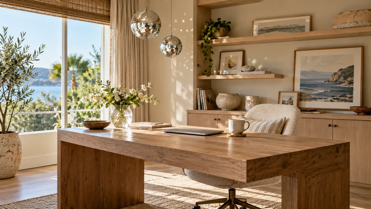
An illustrative creative-room scene; it is not a photograph of Walsh’s space.
For your own room, choose the function before the decoration. If it is a work area, mirrored objects should not throw bright reflections across a monitor or into your eyes; hang one where it catches indirect daylight, then test it at the hours you work. If the room is for rest, keep the reflective detail small enough that it does not compete with the furniture, artwork or a view you want to settle into.
A cactus garden brings Arizona into Western Australia
The outdoor cactus garden is the clearest personal link in the design story: it nods to Walsh’s Arizona roots while belonging to her life near the Western Australian coast. In the fuller profile, the outdoor spaces also include timber furnishings, succulents and a driftwood sculpture selected to relate to the rugged landscape. The point is not that a desert garden can be copied plant for plant into any seaside yard; it is that a personal memory can shape the outdoor palette and materials. (Havenist’s outdoor-space description)
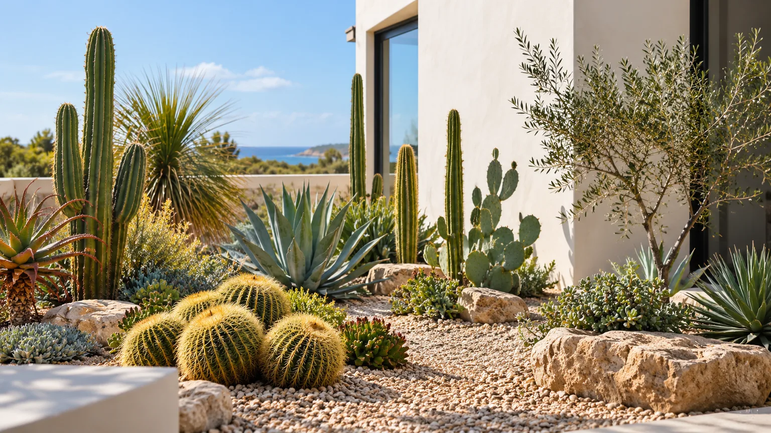
An illustrative courtyard, not a record of the plants in Walsh’s garden.
If you want a garden to carry a personal reference, choose the story first, then adapt it to the actual site. Sun, wind, drainage, salt exposure, water rules, local climate and the mature size of plants all matter; a plant that evokes a memory but struggles in the site will create more work than pleasure. Repeating a few forms or materials between the patio and garden can make the outdoor room feel connected without making every bed look identical.
Let the setting lead without copying it literally
The house’s strongest design move is not “use beach colors.” It is to decide what the surrounding landscape contributes, then edit the interior so those qualities remain visible. Here, ocean views and natural tones provide the broad palette, while timber, woven fibers and greenery help the boundary between inside and outside feel less abrupt.
A room without an ocean view can use the same method. Identify what is actually worth looking at—a tree, courtyard, skyline, garden, or even a well-lit wall—and orient seating toward it. If the view is a neighboring fence or a busy street, use a framed artwork or a plant grouping as the focal point rather than pretending every window looks onto a coast.
Build a warm neutral palette in your own home
Start with the fixed elements you cannot easily change: floor color, wall undertone, tile, cabinetry and the direction and strength of daylight. Then choose one warm base, one supporting neutral and a restrained accent pulled from a real object or view. This produces a more grounded palette than selecting paint from a coastal mood board without checking it in the room.
Livingetc’s designers describe a small set of tones and natural materials as a way to keep Scandinavian coastal rooms simple without making them characterless. Houzz Australia’s coastal case study similarly shows how neutral colors and materials such as timber, natural-fiber rugs and tactile upholstery can support a relaxed, practical room. Those are examples rather than rules: sample finishes in morning and afternoon light, and keep the colors that still feel comfortable when the sun shifts. (Livingetc; Houzz Australia)
Choose tactile materials for daily use
A pale, textured sofa can make a room feel inviting, but its comfort depends on how you live. Before choosing one, check the upholstery composition, removable-cover options, cleaning code, cushion construction and warranty. Bouclé, Sherpa and other looped or nubby fabrics can look similar in photographs while behaving differently under pets, denim, spilled coffee and daily friction; a visual description alone is not a care specification.
Future Classics advises gentle vacuuming, prompt blotting rather than rubbing, protection from strong sun and checking the specific product’s care instructions before applying cleaners or protectors. Treat that as a useful example of a manufacturer’s guidance, not a universal rule for every textile. (Future Classics’ fabric and bouclé care guide)
A coastal setting adds another decision: outdoor furniture and hardware must suit the actual exposure, while indoor fabric belongs inside. Houzz’s designer case study emphasizes robust fabrics and easy-to-maintain choices for a family home; for your own project, confirm the care rating and material specification with the maker instead of assuming that “beachy” means weatherproof. (Houzz Australia’s coastal design case study)
Adapt the look for a rental or compact home
The available profiles do not establish the home’s ownership or lease terms, and they do not document structural changes by Walsh. You can still borrow the design approach without assuming you can repaint, install built-ins or change the floor plan. Start with movable pieces: rearrange seating toward the best view, bring in a textured rug, soften one hard corner with a rounded chair, and use art or a mirror to add personality without altering the building.
In a small home, use one statement curve instead of a full set, keep the walkway clear, and select a table with a lighter visual footprint. A small cactus arrangement in containers can recall a larger garden only if the light and plant-care needs suit the spot; otherwise, a stone, photograph or ceramic object can carry the same personal memory without adding a maintenance task.
Avoid the staged version of coastal minimalism
The first mistake is turning “coastal” into a shopping category: shells, rope, driftwood signs and blue stripes in every room. A few references can be charming, but a room feels more individual when its materials come from the home, the people who use it and the landscape—not from a checklist of beach props.
The second mistake is removing so much that calm becomes sterile. If the room feels like a showroom, add one item with history, a warmer wood tone or a textural fabric before adding more decor. If a pale room feels washed out, introduce a deeper anchor at eye level—a wood table, art frame or green plant—rather than increasing the number of objects on every surface.
The third mistake is choosing a sculptural piece before checking how it functions. A curved sofa, antique bench or mirror ball should solve a visual or practical problem; if it blocks a route, needs constant cleaning, or creates glare, revise the placement or choose a smaller expression of the same idea.
A practical, room-by-room way to begin
Use this sequence before spending money:
- Name the room’s real job. Decide whether it is for lounging, hosting, work, sleep or quiet time; do not style an unused room for a photograph.
- Choose the focal point. Start with a view, fireplace, art piece or garden connection, then arrange seats to support it.
- Keep what already works. Measure and move existing furniture before deciding it must be replaced.
- Soften one hard edge. Try a curved chair, rounded table or woven rug, then walk through the room to test circulation.
- Layer texture and memory. Use a few materials and one personal object rather than filling every shelf.
- Check care and light. Test colors at different hours and read the upholstery or outdoor-furniture specification before buying.
That sequence captures the strongest lesson in Walsh and Coleman’s choices: a restful home is not empty, and a personal home does not need to be busy. Make the big decisions serve the place and the way you live; let a handful of meaningful objects do the storytelling.
Conclusion
Kate Walsh’s Western Australia home is best understood as a collaboration between setting, furniture and personal history. The ocean remains the visual anchor, rounded seating softens modern lines, collected timber and woven textures add warmth, and the cactus garden links a new coastal life to Walsh’s Arizona roots.
For your own home, borrow the reasoning rather than reproducing the props. Protect the view, choose a palette that fits the actual light, mix shapes and materials for a reason, and keep the room comfortable enough to use every day. A design feels like home when it reflects both where you are and what you want to bring with you.