What Colors Go With Lime Green? 15 Room-Ready Pairings
Find 15 colors that go with lime green, from warm white and walnut to navy and coral, with advice on undertones, lighting, placement, and paint samples.
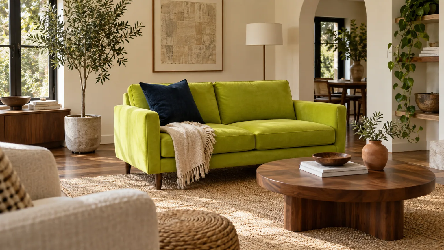
Lime green can make a room feel crisp, sunny, and full of character, but it rarely behaves like a quiet background color. Its yellow-green brightness pulls the eye, so the colors around it need to give that energy a direction: warm it with wood and terracotta, sharpen it with black or navy, or make it playful with pink and blue. The best pairing depends on the exact lime, how much of it you use, and the light your room receives.
If you already own a lime-green sofa, start with the fabric rather than a paint chip: note whether it leans yellow or green, then bring a sample beside your floor, rug, and window treatment. If you are choosing paint, test the color on a large movable board before buying gallons. Screens and store lighting are poor substitutes for seeing a strong color in your actual room.
Start With Your Exact Lime: Yellow-Green, True Lime, or Softened Lime?
“Lime green” is a broad label, not a single standardized hue. Some versions lean strongly toward lemon yellow and feel almost electric; others are closer to leaf green, while softened apple-lime shades have a little gray or white mixed in. Those differences matter: yellow-heavy lime often feels at home with warm wood, peach, and rust, while a clearer green can hold its own beside navy, pink, and charcoal.
Look at the green against a sheet of plain white paper and then beside a medium neutral gray. If the hue appears almost yellow against white, treat it as a warm lime and choose companions with golden, peach, or brown notes. If it reads distinctly green or slightly blue-green, cooler blue-grays and deeper greens may be easier partners. This is a practical comparison, not a laboratory test; the goal is simply to notice which direction the hue leans before you spend money.
Balance Saturation, Lightness, and Area Before Choosing a Partner
A color wheel can suggest families of hues—such as analogous colors beside one another or complementary colors across the wheel—but those relationships do not determine how a room will feel on their own. Adobe’s color-wheel tool makes those relationships easy to explore, yet a pale dusty pink and a neon magenta behave very differently next to lime even though both belong to the pink-red family (Adobe Color). For a livable room, judge three things together: hue, lightness (or value), and saturation.
When lime is the most saturated color, let its partner be quieter, darker, or more neutral. When two colors are both vivid, keep one to a smaller area—a lamp, chair, or artwork—so they look deliberately energetic rather than accidentally competitive. You can use the familiar 60-30-10 proportion as a loose starting sketch, but it is not a rule: a lime sofa may be the room’s large 30% accent, while lime cabinetry can dominate a kitchen if the rest of the scheme is edited.
1. White for Clean Contrast
White gives lime breathing room and keeps a bright green from feeling visually muddy. A warm, soft white makes yellow-leaning lime feel sunny; a crisp, cooler white creates a cleaner, more graphic contrast with green-leaning lime. Try lime on a door, built-in shelves, a single wall, or a sofa, with white on the surrounding walls and ceiling.
This is especially useful in a kitchen, bathroom, entry, or small room where you want color without building a complicated palette. Add wood or woven texture so white does not become stark, and avoid selecting trim from a phone screen: whites have undertones too, and nearby greens can make those undertones more noticeable. Designers also use white walls as a frame for stronger green on doors, trim, or a statement piece (Livingetc on colors that go with green). White works as a frame, but the right white still depends on the fixed finishes around it.
2. Cream and Warm Ivory for a Softer Landing
Cream and ivory take the edge off lime’s brightness. They share warmth with yellow-based greens, so the pairing often feels relaxed and inviting rather than high-contrast. Use ivory walls with a lime chair, warm cream upholstery beside a lime accent wall, or an oatmeal rug below a lime sofa.
Bring in linen, pale oak, and matte ceramic to keep the scheme soft without making it look washed out. A very creamy wall can turn more yellow under warm bulbs; if your lime already has a strong yellow cast, compare a less yellow off-white as well. In a north-facing room, warm cream can counter a cooler atmosphere, but sample it at night too—the color may look richer under lamps than in daylight.
3. Warm Gray for a Quiet, Modern Backdrop
A warm gray can restrain lime without competing with it. Look for gray with a hint of beige or brown rather than a blue cast if the lime is yellow-forward; otherwise, the combination may make the green look sharper and the gray feel cold. Light warm gray on walls works with lime upholstery, while a deeper greige rug or stone surface can anchor a lime accent wall.
Gray is most successful here when it stays clearly lighter or darker than the green. If both colors land at a similar middle value, the room can feel flat even though the hue pairing seems sensible. Paint makers note that both natural and artificial light change how undertones read, so judge the gray with the lime and flooring in place, not in isolation (Benjamin Moore on warm and cool paint colors).
4. Charcoal for Grounded Contrast
Charcoal gives lime an anchor without the hard outline that pure black can create. A charcoal sectional, dark rug, metal window frame, or painted island can make lime cushions, art, or cabinetry feel more intentional. The strong light-dark difference keeps the green visible, while charcoal’s softer edge works well in contemporary and industrial rooms.
Use this combination where there is enough light or warm material to keep the dark area from swallowing the room. A lime sofa against charcoal walls can be striking, but it needs a lighter ceiling, pale rug, or natural-wood surface nearby. In a home office, a charcoal desk wall with a few lime accessories adds energy without making every wall shout.
5. Black for Graphic Definition
Black makes a bright lime accent feel crisp and architectural. Think black picture frames around colorful art, black cabinet pulls on lime cabinetry, a black floor lamp beside a lime chair, or a slim black border on a graphic rug. The dark line separates the green from adjacent colors and gives a room a more modern, high-contrast look.
The risk is using black as a second dominant surface in a small or dim room. Keep it to defined edges and one or two substantial pieces, then add white, cream, or wood to restore visual balance. A black-and-lime palette can skew sporty or retro; softer upholstery, rounded forms, and natural textures help it feel like a home rather than a logo.
6. Walnut and Natural Wood for Warmth
Walnut, oak, and other natural wood tones make lime feel grounded because they add a material contrast as well as a color contrast. Walnut brings dark brown depth and a polished, mid-century note; pale oak keeps the room airy; honey-toned wood leans into the green’s yellow side. Use a wood coffee table or dining table with a lime sofa, or combine lime lower cabinets with oak shelving and stools.
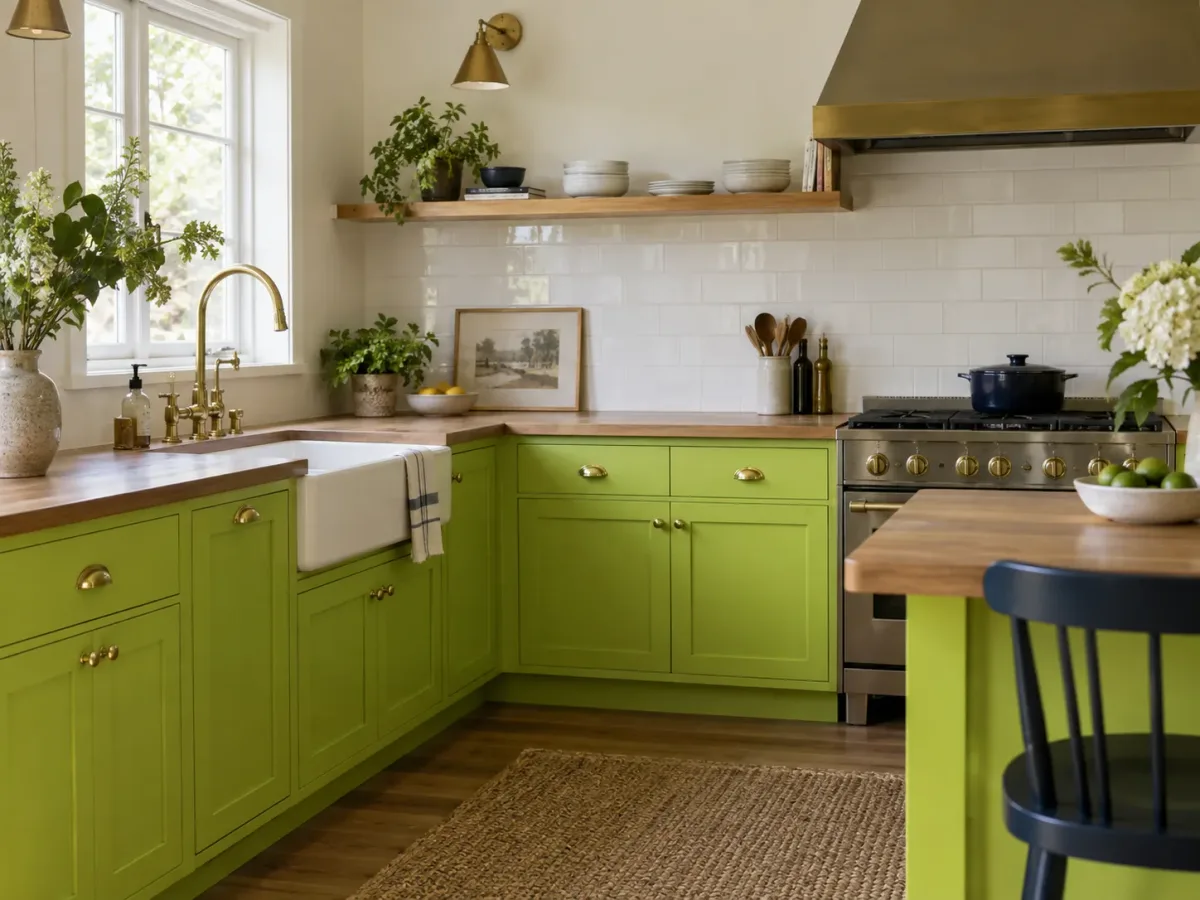
Wood is particularly useful when lime appears on a large surface, such as kitchen cabinetry, because it interrupts the uninterrupted color field with texture and warmth. Let one wood tone lead, then repeat it in a smaller object so the connection feels deliberate. If your floors are already orange or red-brown, test the lime nearby; a strong yellow-green can intensify the floor’s warmth rather than neutralize it.
7. Terracotta and Rust for Earthy Energy
Terracotta and rust bring a red-orange warmth that makes lime feel less citrus-sharp and more collected. The pairing works through contrast: the green is lively, while clay, brick, or rust-colored textiles feel earthy. Try terracotta pots, a rust velvet cushion, a tiled backsplash, or one accent chair with lime walls or cabinetry.
This combination suits dining rooms, kitchens, and living spaces where you want color with a grounded, tactile feel. Keep the terracotta muted if the lime is especially vivid; both colors at full saturation can dominate. Current interior coverage has shown lime used with dusty terracotta and wood for exactly this reason: natural materials temper the intensity without erasing the color (Livingetc’s 2026 green palette coverage).
8. Blush Pink for a Gentle Complement
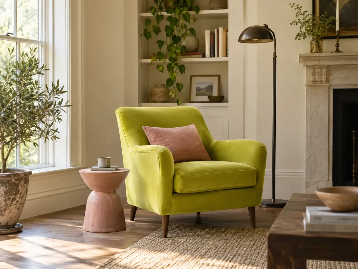
Blush pink softens lime while preserving a playful edge. A pink pillow, upholstered stool, lampshade, or artwork can warm a lime sofa or accent wall without creating the forceful contrast of fuchsia. This works especially well when the pink is dusty rather than sugary and when the room includes cream, wood, or a muted gray to bridge the two colors.
For a bedroom, use blush in bedding or a small upholstered piece rather than coating every surface pink and green. In a reading nook, a blush side table beside a lime chair adds a clear but contained pairing. Interior color consultant Amy Krane, quoted by Livingetc, emphasizes that context and undertones influence which versions of pink and green sit comfortably together (Livingetc on pink and green).
9. Salmon and Coral for a Brighter Warm-Cool Mix
Salmon and coral are warmer, more orange-leaning alternatives to blush. They give lime a cheerful, sunlit partner that works in a breakfast nook, creative room, or lively living room. Use a coral throw, salmon-painted side table, or artwork with both colors rather than equal-sized lime and coral walls.
Because lime already contains yellow, orange-pink shades can make the overall palette feel quite hot. Keep the backdrop pale or natural—white plaster, pale wood, or a light neutral rug—and use a cooler accent such as blue-gray if the space needs another note. This pairing is less about a fixed rule on the wheel and more about calibrating how much warmth the room can comfortably hold.
10. Berry and Magenta for a Confident Color Clash
Berry, raspberry, and magenta create the most theatrical pink-red pairing in this list. They can make lime look even brighter, so treat them as a concentrated accent: a single velvet chair, a lamp, a framed print, or a small repeat in a patterned rug. This can be memorable in a powder room, eclectic dining space, or creative studio.
The exact complement depends on the precise lime shade and the color model being used; a color wheel is a starting map, not a guarantee that a specific paint will harmonize with a fabric. If the two saturated colors feel too loud, reduce the magenta’s area first, or swap it for dusty rose. Keeping the walls neutral and repeating each bold color in two small places makes the clash read as intentional.
11. Powder Blue for a Fresh, Airy Pairing
Powder blue creates a lighter, more open version of a green-blue palette. The pairing works best when one hue is softened: pale blue walls with a small lime trim detail, or a lime chair with powder-blue cushions and warm-white walls. It is an easy choice for a cheerful study, a child’s room, or a sunlit breakfast corner.
If both colors are clear and saturated, the room can tip into a playful or youthful look. That may be exactly right; if you want a quieter result, choose a gray-blue and add a woven natural material. A recent Little Greene pairing covered by Livingetc places sky blue alongside lime and shows how a nuanced, restrained use of the stronger shade keeps the combination fresh rather than overwhelming (Livingetc on sky blue and lime).
12. Navy for Depth and Structure
Navy is a reliable partner when lime needs visual weight. A navy sofa with lime cushions, a navy island beside lime walls, or a deep-blue rug under a lime chair creates an easy-to-read light-dark contrast. Navy feels more layered than black and can connect the green to blue notes in art, textiles, or adjacent rooms.
Use a deep, inky navy when the lime is bright, or a softer denim blue when the green is already subdued. Add white or warm wood between large navy and lime surfaces so the colors do not meet in an uninterrupted block. Navy can also carry through a hallway or open-plan living area, making the lime accent feel connected to the rest of the home instead of stranded in one room.
13. Forest Green for a Layered Green Palette
Forest green gives lime a darker companion within the same broad hue family. The difference in depth is what makes this work: a lime accent wall can sit behind forest-green dining chairs, or a lime cushion can brighten a deep-green sofa. Use the darker green in upholstery, cabinetry, or a rug and keep lime to a smaller surface for a tailored, botanical look.
If the two greens are too close in lightness and saturation, they can blur into one mass. Add a lighter neutral between them or bring in a distinctly different texture—matte painted wood, velvet, linen, or glazed tile. Emerald can be substituted for forest green when you want more jewel-like richness, but it will usually feel more formal and more saturated.
14. Sage and Olive for a More Muted Green Mix
Sage and olive soften lime’s energy and create a more layered, nature-inspired palette. Sage tends to have a gray cast; olive has more yellow or brown, so olive often sits comfortably beside warm lime while sage can make a cleaner green feel calmer. Try sage walls with lime artwork or a lime accent chair, or olive upholstery against pale lime built-ins.
This is a good route if you like green-on-green but do not want a high-contrast emerald-and-lime effect. Vary the lightness and the finish: a matte sage wall beside a textured lime textile reads as layers, not a matching set. If the room already contains lots of plants or outdoor views, sample the shades in place; foliage reflected in glass can add another green cast.
15. Mustard and Golden Yellow for an Analogous Scheme
Mustard and golden yellow echo the yellow component in lime, creating a warm, adjacent-color scheme. Mustard adds depth and a vintage note in a rug, dining chair, or art; a pale golden yellow feels brighter and more casual. Keep at least one of the greens or yellows muted, and use cream, walnut, or charcoal to keep the palette from becoming a solid field of citrus tones.
This pairing works best when you choose a clear lead color. For example, use lime cabinetry with a mustard stool and warm-white walls, or mustard upholstery with small lime details in artwork. If every large surface is bright yellow-green or yellow, the room may feel relentlessly energetic; test the two colors together under your evening bulbs before committing.
Test the Palette in Your Actual Room
Paint, fabric, and digital swatches can shift when light changes. Benjamin Moore advises viewing samples under natural and artificial light and moving a large sample around the room; its guidance also recommends applying at least two coats for a more representative paint sample (Benjamin Moore’s sample guide). Sherwin-Williams defines light reflectance value, or LRV, as the amount of light a color reflects on a 0-to-100 scale, which can help you understand why one color feels brighter or darker in a space (Sherwin-Williams on room direction and LRV).
Use this simple test before choosing the final mix:
- Choose two or three lime candidates and compare their yellow-green balance against white and gray.
- Make large samples. Paint sample boards or use oversized peel-and-stick samples; a tiny chip hides both intensity and undertone. Benjamin Moore suggests moving samples around the room and observing them through the day (sample guidance).
- Place them beside fixed finishes. Check the floor, countertops, tile, existing upholstery, and trim, because each can change how the green and neutral appear together.
- Review the palette in daylight and at night. Include the bulbs you actually use; warm lamps may make a yellow-green look more golden, while cooler light can emphasize a sharper green cast. Window direction is a useful clue—north-facing daylight is often cooler, while south-facing light is often warmer—but trees, nearby buildings, latitude, glazing, and time of day change the result, so observe your actual room (Benjamin Moore’s lighting notes; Sherwin-Williams’ room-orientation guide).
- Repeat the intended proportion. If the finished room will have one lime wall and a navy sofa, test those colors at roughly that scale on a board or in a room-visualization mock-up. A tiny lime sample next to a tiny blue chip cannot predict the effect of two large surfaces.
Pay attention to the finish as well. A high-sheen lime wall reflects more highlights and can make the color feel more insistent; matte paint and textured fabric usually diffuse it. Digital room previews help narrow the options, but monitor settings, photography, and rendering cannot replace a physical sample.
Conclusion
The most dependable colors that go with lime green are the ones that answer a specific need: white and cream calm it, wood and terracotta warm it, charcoal and navy ground it, while pink, blue, yellow, and other greens turn up its personality. There is no single best pairing for every lime, because yellow-green, true lime, and softened apple-lime have different undertones and intensity.
Choose the green first, decide whether it should be the room’s focal point or a small accent, then add one companion color and a neutral or natural material to connect the scheme. Test the combination where it will live and under the lighting you actually use. That brief pause is often what separates a room that feels deliberately colorful from one that simply feels loud.